I created two logos for Cherish Cosmetics, and this animation brings them to life. It starts with a simple line drawing of a face, symbolizing inner growth and self love. The lines reflect natural facial massage paths, guiding users in how to apply the products. As the face blooms, the five product line logos appear, each representing a unique part of the brand. Eventually, these logos are pulled into the primary logo, showing that every element of Cherish is connected. The animation ends with the brand name "cherish" where the dot on the "i" becomes a leaf, a final symbol of growth, nature, and care. This animation is used in marketing and online to clearly explain how the brand’s identity is both unified and meaningful.

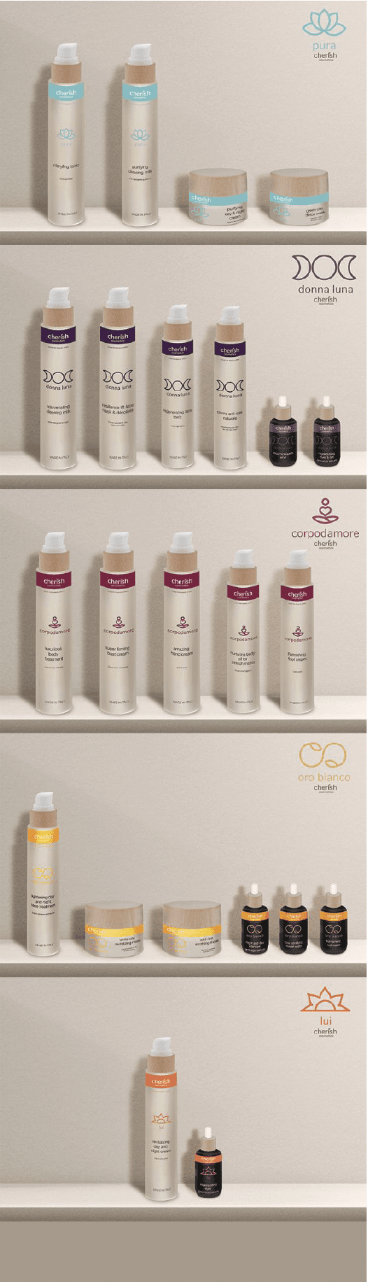
The Pura line is designed to gently purify and deeply hydrate the skin. Each product in this collection is made for those seeking a fresh, clean glow without harsh ingredients. With calming tones and a soft, refreshing scent, Pura brings balance back to the skin while keeping things light, natural, and nourishing.

The Donna Luna line focuses on skin renewal and radiance. Made to smooth, brighten, and support natural cell turnover, these products are ideal for anyone looking to refresh their complexion. With a focus on luminosity and softness, Donna Luna helps reveal glowing, healthy skin with every use.

The Corpodamore line is all about loving and caring for your body. These products are designed to nourish, reshape, and smooth the skin while encouraging daily self care rituals. With rich textures and active ingredients, Corpodamore supports skin elasticity and hydration, making every use feel like an act of love.

The Ora Bianco line is crafted with pure, high quality ingredients to repair, plump, and firm the skin. Each product in this collection is designed to support skin regeneration and enhance natural radiance. Ora Bianco brings a sense of clarity and strength to your skincare routine, leaving skin feeling refreshed, lifted, and deeply restored.

The Lui line is specially designed for men's skin, with products that cater to post-shaving care and overall skin health. Formulated to soothe, hydrate, and protect, Lui helps reduce irritation while promoting smooth, balanced skin. Each product is crafted with ingredients that support resilience and a refreshed appearance, making it the perfect addition to any man’s skincare routine.

The concept behind this design is that as users engage with the self love products, they experience a journey of inner growth. Each bottle features a gradient printed on the inside, which visually represents this transformation. As the product is used, the gradient becomes more prominent, symbolizing the deepening of self-care and personal growth that occurs with each application. This subtle design element reinforces the idea that the act of using these products is not just about external beauty, but about nurturing and evolving from within.

The social media strategy for Cherish Cosmetics focuses on inclusivity and representation. The Instagram account highlights each product with its unique color and theme, ensuring that every product's essence is captured. Posts feature a diverse range of individuals, showcasing different genders, body types, and ages, to demonstrate that Cherish Cosmetics is for everyone. This approach fosters a sense of belonging and encourages users to embrace their own self-care journey, regardless of who they are or where they come from.