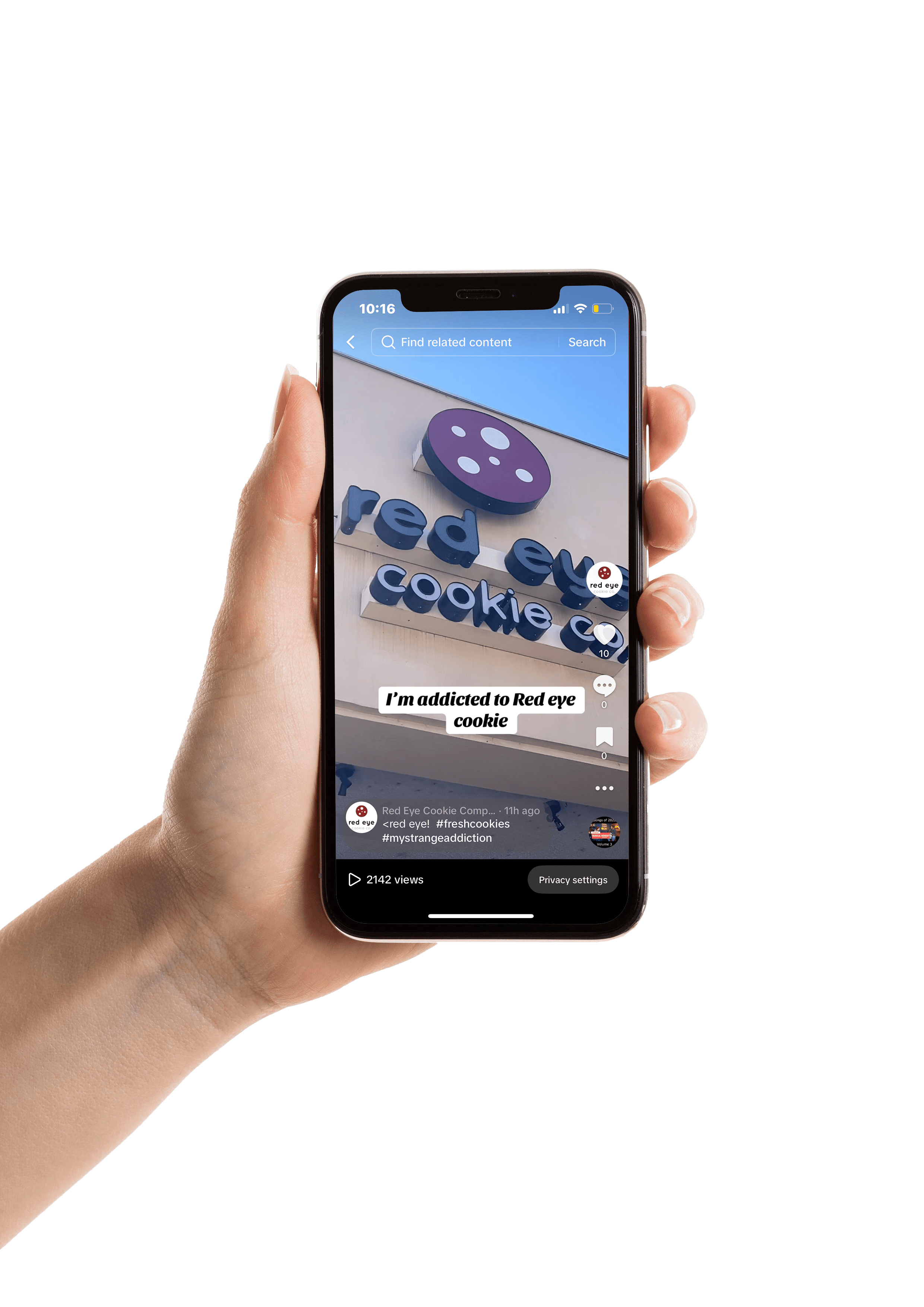

I created two logos for Breathe and Heal Co, each serving a unique purpose. The primary logo is used for physical materials, while the secondary logo is designed for digital platforms. This distinction reflects the brand’s theme of the disconnect between the digital and physical worlds. Both logos align with the brand’s identity and incorporate sacred geometry, enhancing the feeling of balance and connection that the company represents.

The website I created for Breathe and Heal Co is designed to reflect their calming, natural theme, using soft, earthy tones and a clean, intuitive layout. It’s fully responsive, working seamlessly on both tablet and iPhone, ensuring a smooth experience across devices. The site includes options to schedule services, learn about the brand’s offerings, and contact them directly, all while maintaining the peaceful and grounded atmosphere that reflects the essence of Breathe and Heal Co.

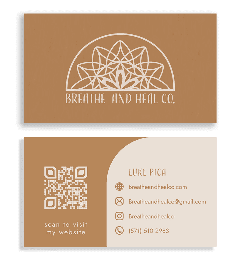

I designed a rack card and a set of business cards for Breathe and Heal Co. that match their warm, calming vibe. The rack card lays out their three main services in a clear and inviting way, with earthy colors and soft patterns that feel grounded and intentional. The business cards are simple but thoughtful, with clean text and a look that feels both professional and personal. Everything ties back to the brand’s mission of helping people reconnect with themselves.